MFSA | Malta

A Reinvented Experience

Challenge

ANCHOVY. was approached by The Malta Financial Services Authority (MFSA), the single regulator of financial services in Malta, to provide them with a new brand identity and create a new experience for their online users.

Brand Identification

We started off with an analysis of websites and branding of similar entities in the market in order to identify current trends and interaction patterns. This led us to also properly identify a list of keywords and values that properly communicate the values of the MFSA and moving forward informed every single part of the project.

Based on our research and numerous stakeholder meetings, we were able to establish an aesthetic language which identifies the brand. This brand identity would be used as the backbone for the rest of the project.

Branding

We were then able to focus on the development of a new logo that encapsulates all of the MFSA’s values. Based on the above research and the client’s vision, we started off by defining what the defining characteristics of the logo will be. This is done to make sure that both clients and designers have a clear vision of the way forward prior to the commencement of a particular project phase.

  • Explore different typefaces and thicknesses.
  • Correct whitespaces, tracking and alignment.
  • Find a more representative colour to the MFSA brand.

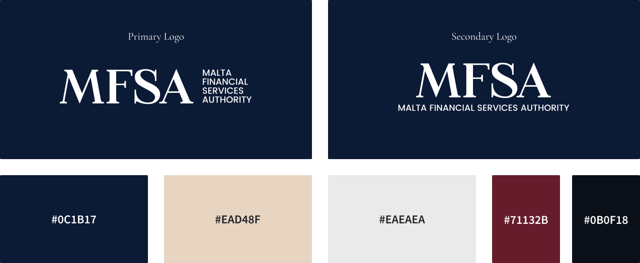
We worked on a variety of custom type designs, as this gave us the freedom to truly create something unique for MFSA. This process required a lot of sketching and refinement. We kept an elegant yet strong feel while also modernising it, which ultimately delivered a very attractive logotype that truly represents the MFSA.

Colour

We completely overhauled the colour scheme with a fresh look that delivered a colour palette dominated by dark blue and white, complemented by a luxurious Bordeaux and contrasting sand colour.
Iconography

Since the subject matter tackled by the MFSA can be extremely tough to digest, it was important that we find a way to streamline the way it’s communicated to the user. For this reason, we created a custom set of icons that would consistently support MFSA communications.

User Experience

The primary challenge was that we not only had to cater for a massive amount of information throughout the project, but also combine three websites that existed separately into one single website. This process required a lot of sitemapping, testing and refinement, which ultimately resulted in a user-friendly website.

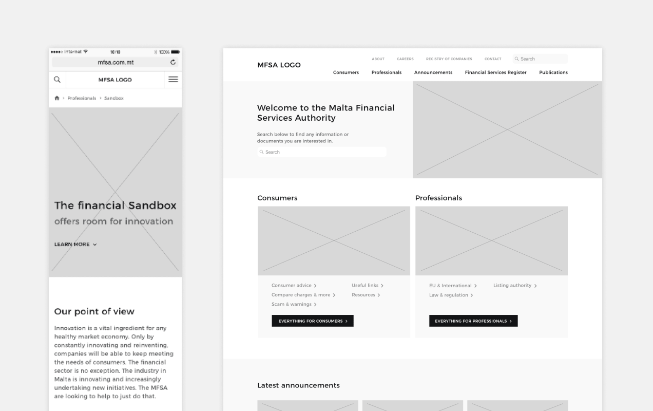
Wireframing

The website wireframe is a visual guide that represents the framework of the website. During this phase we’re still able to easily make any changes before it moves into the design phase.

Navigation

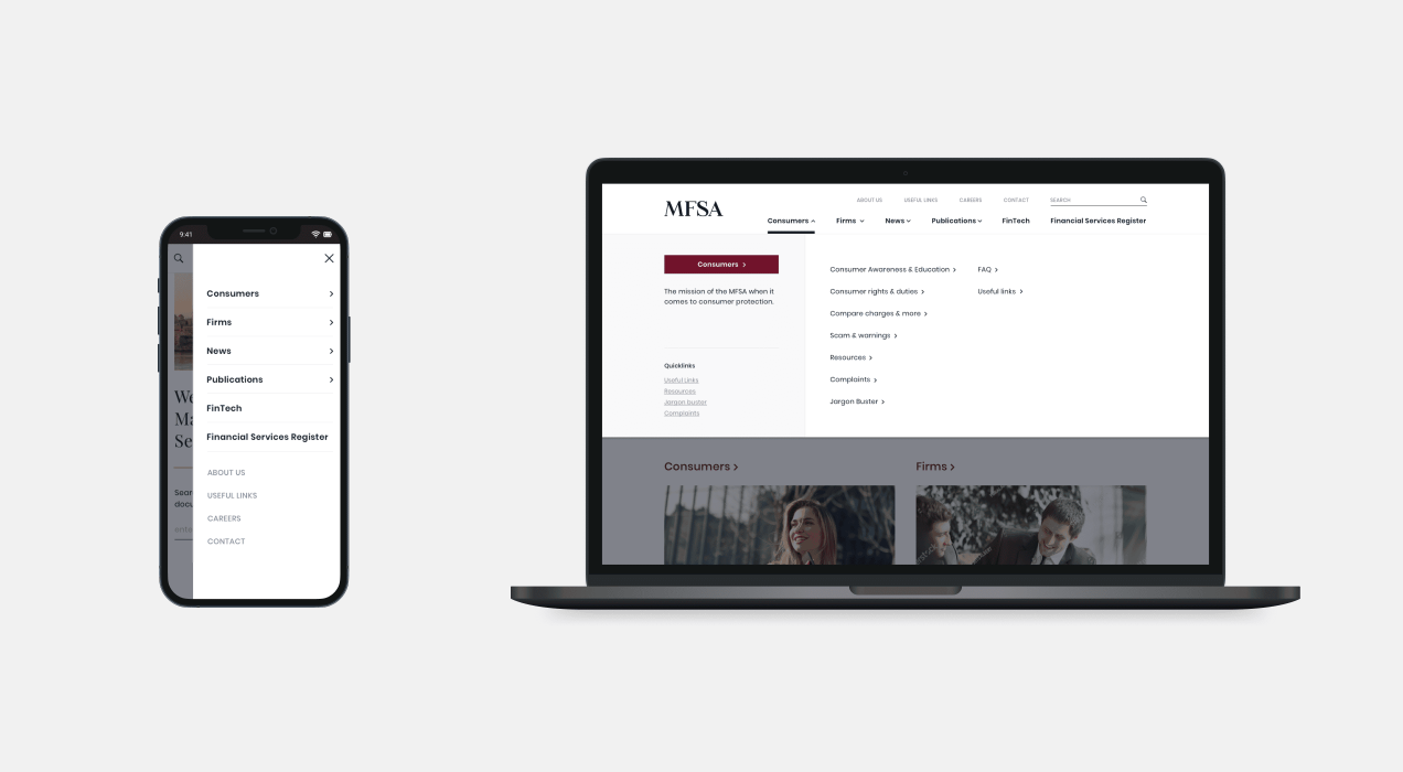
Due to the size of the website, it was important that the user is guided through the website as smoothly as possible. Multiple prominent navigational elements were included for this reason.

Main Menu

Each main menu item has its respective dropdown menu through which the user can easily see what is contained within this section.

Side Menu

Every page would have a side menu which shows deeper layers of content for each section. This was included in order to give users a bird’s eye view of the content contained deeper within that particular section of the website.

UI Design

Before we started designed the website pages, we created a style guide that clearly communicated how to implement anything design related. Elements like button hovers, font sizes, colour usage, etc.

Design

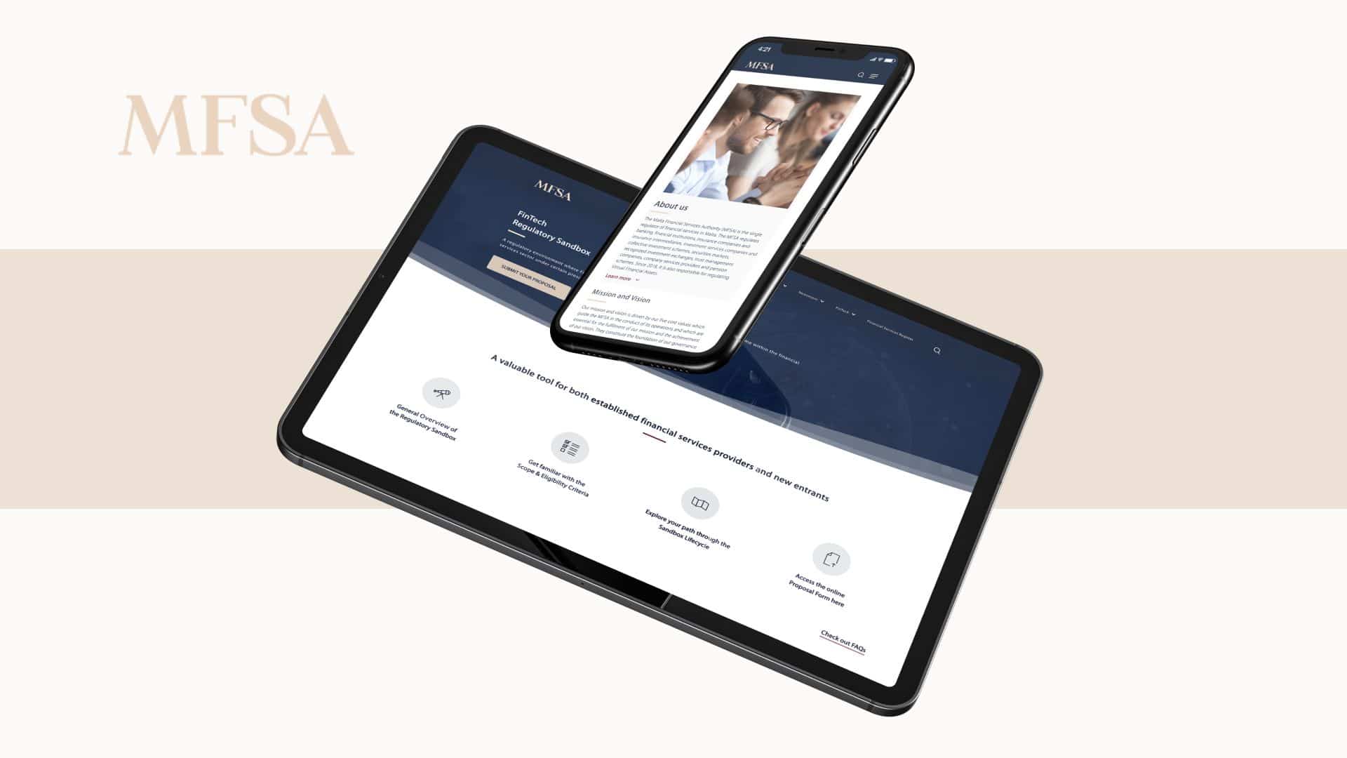
The overall design is bright, elegant and is setup in a wide format to maximise the area available for content. Throughout the website it was important that we included a human element and we did this through cultural imagery, as this communicates feelings of trust and transparency. We also included images of iconic Maltese scenery, so that users had an element of recognition.

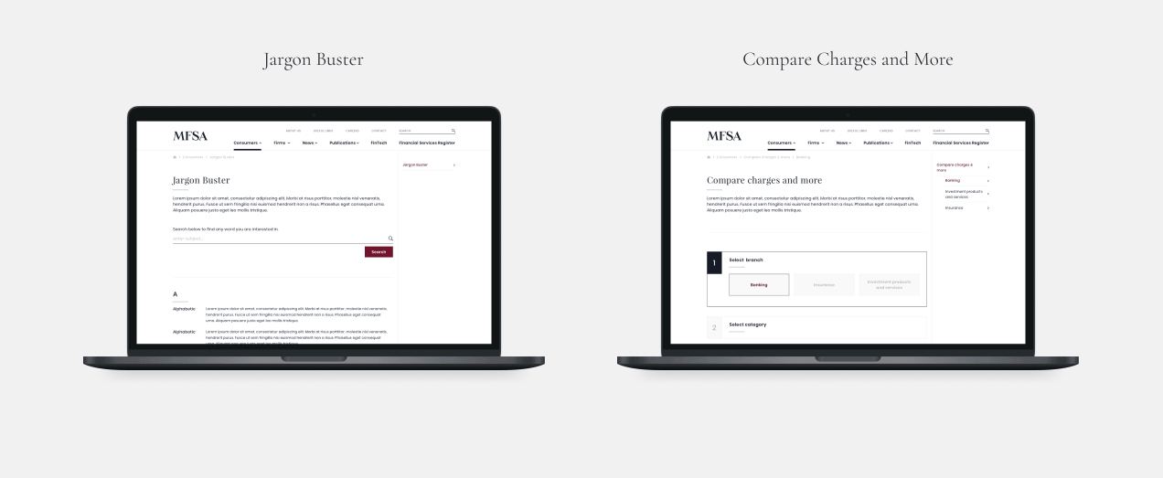
Jargon Buster

We integrated a jargon buster into the site in order to clarify the definitions of some highly technical, frequently used words throughout the MFSA’s communications which might not be clear to everyone.

Compare Charges and More

This functionality is a very helpful tool to the user. It allows them to compare financial services within different branches of the industry through comparative tables.

Mobile

All content had to be adapted to mobile screens in a way that retains clarity of information and ease of navigation throughout.\

Result

This project presented us with some challenges where it came to coding advanced custom functionality such as linking the WordPress website with the SOAP API used to display data on the Financial Services Register and also creating a highly dynamic navigation menu that changes depending on the content uploaded since this was one of the most content-heavy websites we ever worked on with over 700+ pages.